Thursday 31 January 2013
Evaluation Question 2
How effective is the combination of your main product and ancillary texts?
In order for a music video to become successful, it is vital to highlight clear visual links between it and it's own ancillary products being the digipak and advertisment. To begin with, the first step in creating my ancillary work was the production of my front/back panels for my album cover of Sylvie Gray. Like the video itself, it is vibrant, edgy and feminine which is what myself and my group hoped to achieve for our artist's most critical consumers, their target audience. As for the artists image, their appearance plays a vital role in selling their music to their fans. We kept the image of Sylvie Gray from the video into the ancillary products in order to create a 'signature look' for herself making her appearance as a pop artist more noticable and above all distinct. Through the concept of keeping a 'signature look', it allows the artist to sell themselves and become recognised within the music industry for their sense of physical attraction i.e. dresses and bangs (hairstyle).
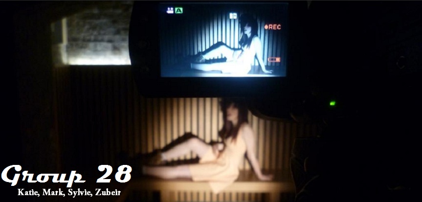
Examples from video below:


Moreover, the most clear visual link for my group's music video and my ancillary products would be the image selling for the artist.
 | |
| The key item of clothing would be the distinctive shoes Sylvie is wearing in both the album cover photos as well as in the music video itself. This shows a strong link to the artist herself linking back to the idea of a 'signature look'. |

As for the advertisement and digipak, the similarities between both are significant. Parallel to the font styles, I made sure that the font style of 'Edo SZ' was used throughout both ancillary products. It is vital that I kept the font style consistent for the audiences to witness Sylvie Gray as the artist she is.
HOW SUCCESSFUL DO YOU THINK YOUR ANCILLARY TEXTS ARE?
The strongest factor of my ancillary work would be the distinct link between both digipak and advertisement through the creation of the artist's logo. The theme of black, gray and hues of red appears to be a simultaneous with both products. The image selection worked particularly well as the clothing of the red rose dress and graphics of the cross 'x' link together as well as the music video as a similar colour scheme was used throughout the segment. The distinction of the artists image with the use of dresses are both incorporated in the music video and the digipak itself. Linking back to the 'signature look' for my chosen artist, I believe this has benefitted the relation between all three products. The symbolism of Sylvie's dress displays the femininity of her image and ultimately appeals to her target audience of young teenage girls aged between 16-19.
DOES YOUR ANCILLARY PRODUCTS APPEAL TO YOUR TARGET AUDIENCE?
Through the use of creating a distinctive look being achieved through the use of mise en scene, (dresses) she is easily recognisable for her target audience. The same concept is applied to the advertisement and digipak, my group decided on keeping her image simple and the image selection is highlighted with the same requirement of poses (looking down, smiling). Moreover, the logo holds a strong representation of who Sylvie Gray is, her 'rebellious' persona is emphasised through the text with its raw, edgy feel. Thus, her image presents a strong parallel to her target audience and her the advantage to be recognisable within the music industry.
Evaluation Question 1
In what ways does your media product use, develop or challenge forms and conventions of real media products?
Evaluation Question 3
How did you use media technologies in the construction and research, planning and evaluation stages?
Tuesday 29 January 2013
Evaluation Question 3
How did you use media technologies in the construction and research, planning and evaluation stages?


Evaluation Question 2
How effective is the combination of your main product (video) and ancillary texts (digipak and advertisement)?
Evaluation Question 1
In what ways does your media product use, develop of challenge forms and conventions of real media products?


Ancillary Work: Advert Progress

To start off my advert I picked an appropriate photo and flipped it to make space on the left

Then I added the text keeping the fonts and colours the same as they appear on the album cover in order to link them together.

Then I added the image of the album cover to show what is on sale and to make it easily recognisable for the buyer

Then I added the ratings. I researched the ratings and reviews for Pixie Lott's real album in order to find suitable companies.

Finally I added a banner at the bottom to showcase the record company logo and the social network links.

Monday 28 January 2013
EVALUATION - USING SURVEY MONKEY FOR AUDIENCE FEEDBACK
In order to improve our music video, it is vital to record data from our target audience's who have seen the music video and give us back critical feed back. By doing so, I have conducted a short survey with 7 questions that relate to the succession of my music video through the use of Survey Monkey.
Below is a screen shot of the survey itself which has been handed out to audiences for a reaction and summary of it's progress.

QUESTION 3:
QUESTION 6:
QUESTION 7:
Below is a screen shot of the survey itself which has been handed out to audiences for a reaction and summary of it's progress.

THE RESULTS:
QUESTION 1:
- 4/9 people ranked the usefulness of the music video appealing to their age group as '7'
- 2/9 people ranked it 8
- 3/9 people ranked it 6
QUESTION 2:
- Majority of the responses said that they enjoyed the lighting effects which were used in Platform, and one respondent put down "the colour scheme ranged well - purple, blue and red all merged together made the video look like a party scene and fit well with the tempo of the song."
QUESTION 3:
- In relation to ancillary products, the following question had an interesting poll of votes for the persuasion of buying the artist's products:
- 6/9 people ranked 4 in the questionnaire
- 2/9 people ranked 5
- 1/9 people ranked 2
QUESTION 4:
- 7/9 people said camerawork
- 2/9 said mise en scene
QUESTION 5:
- 2/9 people said performance
- 1/9 people said camerawork
- 6/9 people said editing
QUESTION 6:
- 5\9 people said good
- 4/9 people said average
QUESTION 7:
- Majority of the responses stated that the editing of the video needed to be a little more improved with the beat of the song, more base tracks. As well as this, the mise en scene needed to be stronger.
Saturday 26 January 2013
Ancillary Work: Inside Panel Progress

I mapped out where the CD would go

Then I added a photograph of the shoes that were featured in the video to create a link between the two products. I kept the colouring simple because I think it looks better. I also didn't want to feature any more photos of the artist as I felt two was enough.

Then I added the artist's name on the CD and arched it so it fit the circle. I matched the font to the font on the cover.

I then did the same with the album title

Finally I added the record label to the CD
Ancillary Work: Front and Back Progress

I started my front and back panels by editing my chosen photographs to make them brighter and giving them a white background.

Then I added my artist name and title of the album, picking two fonts that I think work well. I changed the colour to match the colour scheme I'd previously chosen.

Then I added the track names and numbers to the back panel and used the same font as the album title

Then I added the barcode, logos and legal information and wrote the artist and album name down the spine. I also included the serial number to add to the realistic feel of the product.

Finally I added the website and Twitter to make the product interactive
Friday 25 January 2013
Evaluation - Question 1
Carol Vernallis' theory contains various ideas on how a music video can be edited. One point she makes is that - 'editing may match musical phrases or the beat', which is one convention we followed in our music video.
As the song for our music video was a very up-beat tempo, we wanted to ensure the video matched this. After the chorus the beat fastens up. Due to this, we felt it would be good to fasten the editing along with this. Here is an example of where the editing in our video matches the beat of the song:


Below, you are able to see my Digpak, and the resemblance in colour:

Just like Duffy's 'Rockferry', I kept it simple. The image of the artist is in black white. Despite Duffy's having a real background which has been transformed into black and white, I simple made mine have a grey background, which enabled the colour scheme to match, whilst also looking how I anticipated. One difference between mine and Duffy's front covers are the use of font and it's colour. Duffy's is in a white font, which in my opinion, doesn't enable the words to stand out clearly, especially the album name 'Rockferry'. Because of this, I decided to have my font in red, which I thought meant the words stood out a lot more. I now know I was right. Looking at the two, it's clear that the red font stands out a lot more, thus attracting people looking to buy.

As the song for our music video was a very up-beat tempo, we wanted to ensure the video matched this. After the chorus the beat fastens up. Due to this, we felt it would be good to fasten the editing along with this. Here is an example of where the editing in our video matches the beat of the song:
Andrew Goodwin also had his own theory regarding music videos. One idea that came from his theory was the use of 'amplification', which means: new meanings being introduced that do not contradict with the lyrics by adding layers of meanings.
I felt we covered this theory very well, through our use of polaroid photos layering the video midway through the track.
What these polaroid photos do is adding new meanings. They show different sides to the artist, whilst also reflecting the lyrics in the song. In other words - new meanings have been introduced, but whilst being introduced, they do not contradict with the lyrics of the song. Here, you will see some examples:
The picture below is a shot that doesn't feature regularly in the video, but shows a more playful side to Sylvie. The lyrics in the song aren't serious - showing we aren't contradicting the lyrics, but what we have done is show another side to the artist, which may attract the viewers.

As well as that, the picture below resembles this too:
Layered over the over images, it shows the audience that Sylvie loves clothing. The dress resembles the fact that she is out enjoying herself, which is the message that the song is putting across.

There were various videos that influenced goings on in our own video. A main one was at the start of Pixie Lott's song - 'Boys and Girls'. Take a look:
The shot is at the start of her video, and shows just her legs walking in. We took great inspiration from this as we felt it mystifies the audience from the start, leaving them in the realm of unknown. It gives the video the extra jest of surprise, adding a lot more meaning. The audience want a glimpse of the artist. Here, you will see two still images, one from our video, and one from Pixie Lott's, which show the similarities between the two shots:
Pixie's video:

Our video:

It's easy to see the similarities. I feel we did a good job in finding the right video to be inspired by.
Creating a Digipak after our video was a lot more difficult than anticipated. There were a lot of conventions which needed to be taken into consideration. Practically all Digipak's are in colour, but i desperately wanted mine to be in black and white. In the end, I decided to do this, challenging the convention of a lot of Digipak's.
Small vlog describing this:
Below is the 'Rockferry' album cover by Duffy which I described in the vlog above as an inspiration:

Below, you are able to see my Digpak, and the resemblance in colour:

Just like Duffy's 'Rockferry', I kept it simple. The image of the artist is in black white. Despite Duffy's having a real background which has been transformed into black and white, I simple made mine have a grey background, which enabled the colour scheme to match, whilst also looking how I anticipated. One difference between mine and Duffy's front covers are the use of font and it's colour. Duffy's is in a white font, which in my opinion, doesn't enable the words to stand out clearly, especially the album name 'Rockferry'. Because of this, I decided to have my font in red, which I thought meant the words stood out a lot more. I now know I was right. Looking at the two, it's clear that the red font stands out a lot more, thus attracting people looking to buy.
At the start of our ancillary work, I made a 'prezi' listing the 'do's' and 'don'ts' of design work. I followed these to great accord, which is what helped me create successful products.
An example of this, is something listed on 'don'ts' which was - 'don't feel you need a separate photo on each panel.'
I only used photos that were needed. For example, the front and back of my Digipak only had one photo. This photo was placed on the front, which is what attracts people's attention in shops. On the back I didn't have a photo, yet focused more on the song listing, and also the small text at the bottom warning people over copyright. I also let them know which label she is signed too.
Here:

Subscribe to:
Posts (Atom)