Bye Blogger, it's fair to say I won't miss you.
I hope my hard work culminates in good grades.
Mark

Showing posts with label Mark Mouna. Show all posts
Showing posts with label Mark Mouna. Show all posts
Friday, 1 February 2013

Evaluation - Question 3
As the videos in the power point aren't playing, I'm going to put them down here to be watched:
Video for slide named 'Construction' -
Video for slide named 'Construction 2' -
Video for slide named 'Evaluation' -
Evaluation - Question 4
28. Katie Kensit, Mark Mouna, Sylvie Wilcock, Zubier Bheekharry from 283goswell on Vimeo.
Above is our final video, which is now on 'vimeo'. On vimeo it hasn't got any comments as of yet, so I am unable to derive any conclusions from this side of the feedback.
Below, are two videos from outside of the cinema, after the screening.
The first video, the main thing I learned was that planning is vital in making a music video. The person I was interviewing said he like the scenery of the video and where it was set. This made me happy as we took a lot of time and consideration into this, phoning various venues and also visiting them.
The second video (below) had a lot more information in it that allowed me to understand what we did well and what we did not so well. I asked the question "what was your favourite part of the video?" and it was easy to tell theirs was when the camera spun around in relation to the music. 'The ceiling's spinning round' was the lyric, so we attempted to follow this lyric. It taught me that using filming techniques to go with the lyrics is a great idea, and that it can really help the audience delve further into the video.
I then asked "If we had the exact same footage, but were to start editing again, what could we do differently?" to which I had great answers.
1. Less shots of her near the brick wall.
This was a good answer in my opinion, as it's exactly what I would do myself. It taught me that within a video you shouldn't have too much of one background, and it's something I'd do differently given the opportunity.
2. More camera movement.
This is something we realised as a group we didn't have a enough of when we began editing. It taught me that you should have a set amount of 'still' shots with the camera, and the rest should involve movement, as it helps engage the audience, whilst also keeping the video a lot more entertaining.
Now, I ask myself if the audience reaction makes me look at my video in a different light.
The simple answer is, yes. This is because I didn't notice a lot of these things during editing as time certainly wasn't on our side.The good things that were pointed out makes me proud of the video, but the improvements suggested definitely make me want to go back and edit, to get the video to a much higher level.
Finally, a short vlog from me on the audience reaction in the cinema:
Evaluation - Question 2
I have interviewed a fellow student and asked them to give their thoughts on the effectiveness of the combination of my video and my ancillary work:
From this video I am able to see that it is easy to link my ancillary work and video. It tells me that the effectiveness is of a good standard, and people can clearly understand both are from the same artist, promoting her music.
At the start of this project, our group identified our target audience primarily as teenage girls. I believe my ancillary texts are extremely attractive to them and this is for many reasons.
1. The use of 'Kiss FM' to rate the album attracts anyone who finds the radio station good, which is a radio station that largely attracts our target audience.
2. The smile used on each picture is extremely welcoming to any potential customers or fans.
3. The font type and colour is what some may call 'girly', which in turn attract the audience that we have identified. The use of the colour red on a grey background also enables it to thoroughly stand out.
Friday, 25 January 2013
Evaluation - Question 1
Carol Vernallis' theory contains various ideas on how a music video can be edited. One point she makes is that - 'editing may match musical phrases or the beat', which is one convention we followed in our music video.
As the song for our music video was a very up-beat tempo, we wanted to ensure the video matched this. After the chorus the beat fastens up. Due to this, we felt it would be good to fasten the editing along with this. Here is an example of where the editing in our video matches the beat of the song:


Below, you are able to see my Digpak, and the resemblance in colour:

Just like Duffy's 'Rockferry', I kept it simple. The image of the artist is in black white. Despite Duffy's having a real background which has been transformed into black and white, I simple made mine have a grey background, which enabled the colour scheme to match, whilst also looking how I anticipated. One difference between mine and Duffy's front covers are the use of font and it's colour. Duffy's is in a white font, which in my opinion, doesn't enable the words to stand out clearly, especially the album name 'Rockferry'. Because of this, I decided to have my font in red, which I thought meant the words stood out a lot more. I now know I was right. Looking at the two, it's clear that the red font stands out a lot more, thus attracting people looking to buy.

As the song for our music video was a very up-beat tempo, we wanted to ensure the video matched this. After the chorus the beat fastens up. Due to this, we felt it would be good to fasten the editing along with this. Here is an example of where the editing in our video matches the beat of the song:
Andrew Goodwin also had his own theory regarding music videos. One idea that came from his theory was the use of 'amplification', which means: new meanings being introduced that do not contradict with the lyrics by adding layers of meanings.
I felt we covered this theory very well, through our use of polaroid photos layering the video midway through the track.
What these polaroid photos do is adding new meanings. They show different sides to the artist, whilst also reflecting the lyrics in the song. In other words - new meanings have been introduced, but whilst being introduced, they do not contradict with the lyrics of the song. Here, you will see some examples:
The picture below is a shot that doesn't feature regularly in the video, but shows a more playful side to Sylvie. The lyrics in the song aren't serious - showing we aren't contradicting the lyrics, but what we have done is show another side to the artist, which may attract the viewers.

As well as that, the picture below resembles this too:
Layered over the over images, it shows the audience that Sylvie loves clothing. The dress resembles the fact that she is out enjoying herself, which is the message that the song is putting across.

There were various videos that influenced goings on in our own video. A main one was at the start of Pixie Lott's song - 'Boys and Girls'. Take a look:
The shot is at the start of her video, and shows just her legs walking in. We took great inspiration from this as we felt it mystifies the audience from the start, leaving them in the realm of unknown. It gives the video the extra jest of surprise, adding a lot more meaning. The audience want a glimpse of the artist. Here, you will see two still images, one from our video, and one from Pixie Lott's, which show the similarities between the two shots:
Pixie's video:

Our video:

It's easy to see the similarities. I feel we did a good job in finding the right video to be inspired by.
Creating a Digipak after our video was a lot more difficult than anticipated. There were a lot of conventions which needed to be taken into consideration. Practically all Digipak's are in colour, but i desperately wanted mine to be in black and white. In the end, I decided to do this, challenging the convention of a lot of Digipak's.
Small vlog describing this:
Below is the 'Rockferry' album cover by Duffy which I described in the vlog above as an inspiration:

Below, you are able to see my Digpak, and the resemblance in colour:

Just like Duffy's 'Rockferry', I kept it simple. The image of the artist is in black white. Despite Duffy's having a real background which has been transformed into black and white, I simple made mine have a grey background, which enabled the colour scheme to match, whilst also looking how I anticipated. One difference between mine and Duffy's front covers are the use of font and it's colour. Duffy's is in a white font, which in my opinion, doesn't enable the words to stand out clearly, especially the album name 'Rockferry'. Because of this, I decided to have my font in red, which I thought meant the words stood out a lot more. I now know I was right. Looking at the two, it's clear that the red font stands out a lot more, thus attracting people looking to buy.
At the start of our ancillary work, I made a 'prezi' listing the 'do's' and 'don'ts' of design work. I followed these to great accord, which is what helped me create successful products.
An example of this, is something listed on 'don'ts' which was - 'don't feel you need a separate photo on each panel.'
I only used photos that were needed. For example, the front and back of my Digipak only had one photo. This photo was placed on the front, which is what attracts people's attention in shops. On the back I didn't have a photo, yet focused more on the song listing, and also the small text at the bottom warning people over copyright. I also let them know which label she is signed too.
Here:

Thursday, 24 January 2013


Wednesday, 23 January 2013
'Kiss FM' On My Advert
On my Advert, I included a four star rating for Sylvie Gray by the radio station 'Kiss FM' - I believe this is important as Sylvie's type of music is likely to be played on Kiss, and Sylvie's main audience are most likely to listen to it. Therefore, it draws attention straight away - if the radio station rates the music, then they are most likely going to play it. Attracts new fans right away.

The comment 'sensational debut album' also aids the artist as it creates a buzz around the album.
*Note* I decided to rate it 4, instead of 5 stars to keep it realistic.
The comment 'sensational debut album' also aids the artist as it creates a buzz around the album.
*Note* I decided to rate it 4, instead of 5 stars to keep it realistic.
Advert Thoughts
During the process of my advert making - I came across a few obstacles that had me tied in knots as to what to do. The first was the back ground colour of it.
I began with a pink tinted background, as I wanted it to relate to the colour scheme of our video. It looked like this:

However, after some deliberation, I decided to stick to what I had planned, which was a black and white background.
This has many positives:
-Makes the artist standout more.
-Relates to my Digipak.
-Allowed me to include the same colour scheme as my Digipak.
-The colour of my font stands out.
I moved Sylvie over to the left, and as mentioned, changed the colour of my background:

I added Facebook and Twitter logos, which were mentioned in my mock-up. These allow people to find the artist easily, whilst allowing the artist to create a close connection with her fans:


Soon you will see the finished version of my Digipak, and I hope understand the thinking behind my product.
I began with a pink tinted background, as I wanted it to relate to the colour scheme of our video. It looked like this:

However, after some deliberation, I decided to stick to what I had planned, which was a black and white background.
This has many positives:
-Makes the artist standout more.
-Relates to my Digipak.
-Allowed me to include the same colour scheme as my Digipak.
-The colour of my font stands out.
I moved Sylvie over to the left, and as mentioned, changed the colour of my background:

I added Facebook and Twitter logos, which were mentioned in my mock-up. These allow people to find the artist easily, whilst allowing the artist to create a close connection with her fans:


Soon you will see the finished version of my Digipak, and I hope understand the thinking behind my product.
Advert Mock Up
Before I made my advert I created a quick mock up which enabled me to finish my advert in necessary timing. The mock up allowed me to find what I needed and place it in photoshop without many deliberations.
Here you will see some pictures of my mock-up:
This image is my mock-up in full. As you will see there isn't too much in the way of detail, but it was enough for me as all I needed was down on the sheet.

Below are a few closer shots to enable you to read properly and also match it with my Advert.
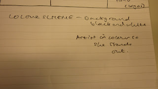


As you will see with the end product of my advert, I've followed what I planned. The only thing I've changed is where I've placed the record label logo, which is now in the bottom right corner, rather than being in the bottom left.
Here you will see some pictures of my mock-up:
This image is my mock-up in full. As you will see there isn't too much in the way of detail, but it was enough for me as all I needed was down on the sheet.

Below are a few closer shots to enable you to read properly and also match it with my Advert.


As you will see with the end product of my advert, I've followed what I planned. The only thing I've changed is where I've placed the record label logo, which is now in the bottom right corner, rather than being in the bottom left.
Wednesday, 16 January 2013
Digipak Front And Back Modifications
The first thing I decided to modify on the front of my Digipak was the positioning of the album name. Despite liking where it was - I felt it needed to be higher on the panel to allow it to stand out more. I put it below the artist name, and it looks like this:

What I did next was make sure I had the correct text down the side panel, which links the front and back of the case together. After doing research - it was plain and simple. Album name and artist name. This is what I've done:

Also, on the side panel I saw that a lot of Digipaks have the digits across the bar code written at the bottom, so I thought I'd ensure mine looked professional and decided to do it again:

You can see that the numbers are the exact same as those on my bar code:

Finally - I've added small print at the bottom of the back side. This small print includes information on record company and how it owns the rights to the CD. It also goes on to explain what is prohibited with the CD.
It has a website and Twitter name for buyers looking to find out more about the artist:


What I did next was make sure I had the correct text down the side panel, which links the front and back of the case together. After doing research - it was plain and simple. Album name and artist name. This is what I've done:

Also, on the side panel I saw that a lot of Digipaks have the digits across the bar code written at the bottom, so I thought I'd ensure mine looked professional and decided to do it again:
You can see that the numbers are the exact same as those on my bar code:
Finally - I've added small print at the bottom of the back side. This small print includes information on record company and how it owns the rights to the CD. It also goes on to explain what is prohibited with the CD.
It has a website and Twitter name for buyers looking to find out more about the artist:

Tuesday, 15 January 2013
Research: Photoshop
For my ancilary work, Photoshop is extremely important, as it is what is enabling me to merge the correct pictures with what I want on my cases. It also allows me to easily access the template with which I wanted to use.
Photoshop is easy to use and very helpful. Below, you can see how easy it is to add a template to Photoshop, which is fundamental in creating the product:

This is the toolbar which is very simple to use - allowing students the chance to finish work to a better standard:

Finally, we have the 'layer' bar on the bottom of the screen, which shows you how many pictures you've used, and also allows you to insert pictures without putting them on your case until necessary:

All in all, Photoshop is extremely easy to use, and I'm glad I've got the opportunity to use it.
Photoshop is easy to use and very helpful. Below, you can see how easy it is to add a template to Photoshop, which is fundamental in creating the product:

This is the toolbar which is very simple to use - allowing students the chance to finish work to a better standard:

Finally, we have the 'layer' bar on the bottom of the screen, which shows you how many pictures you've used, and also allows you to insert pictures without putting them on your case until necessary:

All in all, Photoshop is extremely easy to use, and I'm glad I've got the opportunity to use it.
Background Picture
On the back of my Digipak, I decided to ensure there was an image that in someway symbolic to the image on the front of it. The front picture is a medium close up of our artist Sylvie, and it is clear to see that on her dress are various flowers, namely roses. For this reason, I decided to fade an image of a rose in the background, behind the song listing.
The rose looks similar to this:

The rose also adds to the visual aid, which I feel is very important in helping it stand out, and also attracting sales.
The rose looks similar to this:

The rose also adds to the visual aid, which I feel is very important in helping it stand out, and also attracting sales.
Wednesday, 9 January 2013
Digipak Making
I'm in the process of creating my Digipak and I thought I'd give a little update.


I also intend to add this rose in. It won't be easy as I've got to cut around the edges of the rose to ensure I'm not putting anything other than the rose in:

I started off like this:


However, after a while I decided to change the font colour. This was for the benefit of the buyer who could read the writing a lot more clearly, and also for myself, as I came up with the idea of putting a rose in to match the colour of the writing, and also to create a visual match with the dress Slyvie is wearing.
It looks like this at the moment:

I intend to add my barcode in soon:
I also intend to add this rose in. It won't be easy as I've got to cut around the edges of the rose to ensure I'm not putting anything other than the rose in:
Sunday, 6 January 2013
Analysis Of Digipaks
Rihanna's Digipak contains very similar music to our artist and what she'd be having on her own Digipak. The music is a very upbeat tempo, and largely attracts the same fan base. As an artist, Rihanna is very powerful in her notes, much similar to the artist in our video. The Digipak helps convey this with the use of bold colours and images.


It would be a good idea for myself to try and replicate the use of bold colours and images as it conveys the artist in a good manner, and in my opinion would help make it stand out in a shop, therefore boosting sales.
Next, Britney Spears' music relates to the genre of our artist extremely well. You could say that Britney was the heartbeat of the 'Pop' genre for a long time, therefore making her an extremely suitable choice. Below, you can see her Digipak:
She relates to the audience of our artist as they create very similar sounding music, and also both carry the same style and image.

The Digipak shows a lot of the artist, which in turn promotes her image. I hope to incorporate this into my very own Digipak, as I believe it's a good way for an artist to gain recognition from others, and also gain new fans.
Finally, we have Diana Vickers.

Just like Britney Spears, she carries much the same image as our artist. However, she isn't as closely related to the music genre as Rihanna or Britney. I thought it'd be good to put her in as she can easily relate to our artist, and is some way in and out of the genre in question.
The Digipak itself is very simple, which I like. There's one image of the artist, which very clearly shows her face. Her name is written in big letters on the CD and there's information scattered around. It's simple, but very effective. It definitely gives me inspiration as to how I may have my own Digipak.
Saturday, 29 December 2012
Trip To The Cinema
Before Christmas all Media students went to the cinema to watch our videos on a big screen. Watching our video on the big screen was very beneficial and enabled me to realise what we could've done different to our video given another chance.
After the screening had finished, we asked fellow students to answer a few questions about our video. Some questions included 'favourite part of the video?' and 'what would you improve?' to which we had some great answers.
This is the cinema we went to:

After the screening had finished, we asked fellow students to answer a few questions about our video. Some questions included 'favourite part of the video?' and 'what would you improve?' to which we had some great answers.
This is the cinema we went to:

Monday, 17 December 2012
Ancillary: Class Discussion
In class we had a thorough conversation on 'the importance and function of digipaks to the music industry' and what popped up was very helpful indeed.
We started off with the question - 'what is a digipak?' and within discussion we came up with two good answers to sum it up. These were:
- A modern approach to CD packaging.
- Allows for inclusion of more information about a band/artist.
We then moved on to the question - 'why are digipak cases still used, given the drop in sales?' to which we came up with the answers:
- Makes the fans feel a lot more special.
- Gives fans a chance to remember why they liked the artist in years to come.
- The artwork is needed for downloads.
- The artwork can be used as an advertisement.
Finally, we encountered the question: 'how important are the ancillary products to the artist and the industry?' to which we answered:
- Promotes the music and image of the artist.
- Makes money.
- A way of connecting with the fans.
- Helps sell the label (which in turn makes revenue).
Doing this activity in class was extremely benificial in my thought process behind my owm digipak. It made me think more about my artist and who her fan base would be, in turn allowing me to base it on atteacting them.
We started off with the question - 'what is a digipak?' and within discussion we came up with two good answers to sum it up. These were:
- A modern approach to CD packaging.
- Allows for inclusion of more information about a band/artist.
We then moved on to the question - 'why are digipak cases still used, given the drop in sales?' to which we came up with the answers:
- Makes the fans feel a lot more special.
- Gives fans a chance to remember why they liked the artist in years to come.
- The artwork is needed for downloads.
- The artwork can be used as an advertisement.
Finally, we encountered the question: 'how important are the ancillary products to the artist and the industry?' to which we answered:
- Promotes the music and image of the artist.
- Makes money.
- A way of connecting with the fans.
- Helps sell the label (which in turn makes revenue).
Doing this activity in class was extremely benificial in my thought process behind my owm digipak. It made me think more about my artist and who her fan base would be, in turn allowing me to base it on atteacting them.
Friday, 14 December 2012
Digipack Mock Up
For our ancillary work we were asked to create a mock up of our Digipak before we went on to make the real thing. Here you will see the mock up of the front and back of mine:
Front (right) and back (left) -

Front on it's own -

Back on it's own -

I've decided to keep it relatively simple so it's easy to replicate on my final product. However, with it being simple doesn't mean it won't look good, it enables me to make certain aspects stand out (such as the artist name) whilst also making it look extremely neat and tidy so customers are attracted to it right away.
Front (right) and back (left) -

Front on it's own -

Back on it's own -

I've decided to keep it relatively simple so it's easy to replicate on my final product. However, with it being simple doesn't mean it won't look good, it enables me to make certain aspects stand out (such as the artist name) whilst also making it look extremely neat and tidy so customers are attracted to it right away.
Tuesday, 11 December 2012
Digipak Thoughts
I have been thinking what type of Digipak I'd be better off making.
The two options I've got are a six panel, or a four panel.
The six panel looks as follows:

There are many advantages in a six panel Digipak, and means I can add more information in middle slots, or even extra pictures of our artist. However, the four panel Digipak (as seen below) means I'd be able to pay a lot more attention to detail. It means I'd be able to spend more time on each particular aspect, instead of worrying about what I want to add in the final two panels.

Also, I believe a four panel Digipak looks a lot nicer than a six panel one. It requires a lot more attention to detail, and whilst it has less in it than a six panel, it creates a great sense of belonging to any fan who would be buying it.
The two options I've got are a six panel, or a four panel.
The six panel looks as follows:

There are many advantages in a six panel Digipak, and means I can add more information in middle slots, or even extra pictures of our artist. However, the four panel Digipak (as seen below) means I'd be able to pay a lot more attention to detail. It means I'd be able to spend more time on each particular aspect, instead of worrying about what I want to add in the final two panels.
Also, I believe a four panel Digipak looks a lot nicer than a six panel one. It requires a lot more attention to detail, and whilst it has less in it than a six panel, it creates a great sense of belonging to any fan who would be buying it.
Subscribe to:
Posts (Atom)